Is your team still finding it difficult to get accustomed to Salesforce Lightning UI? If so, you are not alone. Many businesses have made the transition from Salesforce Classic to Lightning. However, ensuring everyone benefits from the transition can be quite challenging.
Salesforce has undergone multiple changes over the years. There used to be the Classic interface and then came Lightning, which offered a more modern look and additional features. Now, the new enhanced Lightning UI is here with even more opportunities. However, this update is not only cosmetic. It is designed to help your team work smarter and faster.
In this guide, we provide actionable recommendations aimed at helping your team adopt Lightning UI. We discuss common problems, automated testing, crucial Lightning components, and customization options to better suit your requirements. Let’s help your team value all the features that come with Lightning.
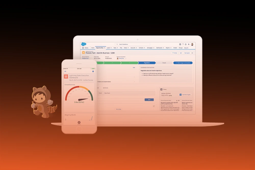
The Salesforce Lightning UI is an upgrade over the previous Salesforce interfaces as it is more user-friendly. Its modern interface is visually appealing and increases efficiency. Unlike Classic, Lightning offers helpful tools and features as well as a streamlined appearance.
With Lightning, you can customize your dashboard. It allows you to access critical information swiftly, which is vital for every team in sales, marketing, or support.
Salesforce continues to improve Lightning with every update. The Enhanced Lightning UI is the latest update, which allows users to customize their workspace and automate basic tasks. This ensures every team focuses on what is most important.
To improve the experience of using Salesforce, a new Salesforce Lightning UI will be rolled out along with its enhanced Salesforce Lightning UI version in 2025. The updated interfaces are intended to improve productivity as well as the visual appeal.
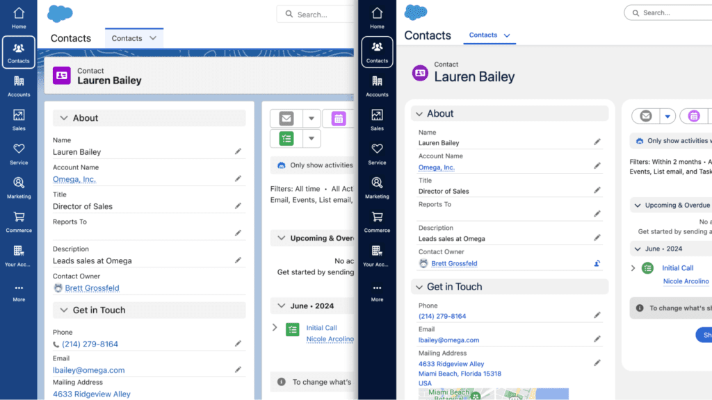
The most prominent change is in visual design. All hyperlinks on the new interface have to be clicked and would be easier to see and also smoother to click, given that everything has rounded edges. The user interface has separate folders and task tabs, which would save both time and effort on say user's clicks. The colors have also changed, which makes the reading of the interfaces easier for all categories of users.
The updates come from the Salesforce Cosmos and the new Salesforce Lightning Design System 2.0 (SLDS 2.0). They maintain a cohesive appearance and ensure proper functionality across devices.
Every user will experience these changes differently. Sales representatives can quickly access critical functions. Support staff have improved the visibility of case details. Admins enjoy smoother customization workflows. The tailored Lightning UI focuses on improving productivity for all users.
As of 2024, Salesforce plans to implement the new 'Cosmos' theme on Lightning, which will be rolled out fully in 2025. They claim the theme is user-friendly and minimizes workload. With the new look, buttons are rounder and softer, colors are brighter, and fonts are clearer. Additionally, icons are simpler. However, all Lightning functionalities, like clicking buttons or using reports, still work. The changes are purely cosmetic.
If you had the Starter or Pro Suites or were a specific Sales Cloud user, you received the new Cosmos look around June and July of 2024. For Starter and Pro Suites, it applies to all your existing and new setups. For Sales Cloud Pro or Enterprise, only new accounts created during that period received it. But don't worry, if you prefer the old look, you could always turn off Cosmos in Setup → Themes and Branding.

Salesforce has updated the style by changing buttons, fonts, colors, borders, and spacing. The design now adopts the softer round edges that are inspired by the Salesforce Cloud logo. The brightened colors and softer fonts provide better clarity and reduce mistakes. This reduces visual errors and eases the user experience. The latest updates enhance the design for improved visual accessibility and ease.
Most users won’t have any issues with your apps and pages. If you have custom Lightning components, they might require some tweaks on your end to style them uniformly with the new look. Sites within Experience Cloud will not be affected by this change.
The revamped Lightning UI is intended for more than just aesthetics; helping you complete your work more quickly is a priority as well. The new layout encodes the important information you need in a streamlined manner, so you get the important tasks done without wasteful searching. It aims to be intuitive while offering a lower learning curve, so users who desire to work more efficiently will appreciate this change.
Salesforce will keep updating the UI, strengthening the integration between technology practices and user expectations. This is only the initial stage of a streamlined, enhanced, intuitive, and highly efficient system, Salesforce Lightning UI, that assists your team.
What’s the Difference Between Salesforce Classic and Salesforce Lightning?
The older version of Salesforce is called Salesforce Classic. It has been in use for many years; some people still use it because they are accustomed to it. Despite its simpler design, Classic does have a less and fewer features.
Salesforce Lightning is the newer version. It has an appealing modern look and ease of use. With its numerous additional time-saving tools like drag-and-drop dashboards and advanced reporting tools, Lightning makes working faster and easier. Additionally, it is accessible on mobile phones and tablets.
Helping teams achieve more with less effort and resources is the goal of Lightning. It makes doing work smarter and faster quite easy, which helps with overall productivity. That is one of the reasons Salesforce wants to focus on Lightning for the future base and why so many companies are shifting from Classic to Lightning.
Despite the many advantages Salesforce Lightning UI presents, some teams still struggle with full adoption. Here are the five most common reasons:
Users often pose the question, “Why fix what isn’t broken?” Familiarity with outdated practices often breeds aversion towards new approaches.
There are users who find Lightning harder to use and slower in performance. Sometimes they are right, but often, it’s just a perception. If configured correctly, Lightning is highly efficient and stable.
For newcomers, Lightning has a lot of buttons and features. If users do not know their way around or how to use new sections, it can be very annoying.
Without a detailed training guide, users may become disoriented. Different user roles require specialized training, which will make the process faster and bolster confidence.
If administrators make changes to the system that users cannot readily report, matters are left unattended. Having well-defined user problems aids in the resolution of issues and enriches overall use.
Adopting Salesforce Lightning UI requires thoughtful preparation and execution to get your entire team on board. Consider these proven tips to ease the transition:
Start with a managed cohort of enthusiastic veteran users. Give them to try new features, then provide feedback that will shape the new guides. Helping these testers makes everything smoother for everyone.
A single guide won't work because of the different ways various teams use Salesforce. Separate guides should be made for sales reps, support agents, and even admins. This way, everyone learns their most relevant material.
Make sure to use Salesforce's in-built help systems like In-App Guidance. These pop-up hints help show users the steps one at a time. Moreover, with Trailhead, you can learn Lightning through free online courses at your own pace.
Help your team understand the significance of switching to Lightning. Describe the ways it will optimize their work, making it quicker, simpler, and more impactful. When people understand how useful it is, they are much more willing to adopt it.
As a Salesforce user, you know that Lightning UI components are the core of using Salesforce Lightning. These are tools that you can place on pages to optimize the interface. There are two types of components to consider.
These components are available out of the box with Salesforce. They include lists, charts, and calendars.
Admins and developers use custom components in the Lightning APP Builder to create pages, dashboards, and applications that meet their teams’ specific needs.
These components enhance the user experience by streamlining tasks, automating repetitive processes, and improving overall efficiency. Once configured, admins can reuse these components across various apps and pages within Salesforce, ensuring consistency and saving time.
The best part is that admins can customize these components without writing any code, making customization accessible to those without programming expertise. Any admin can modify team-specific pages and layouts through the Lightning App Builder using simple drag-and-drop mechanisms.
Verifying your Salesforce Lightning UI through automation is crucial. It ensures efficiency and optimal performance. Automated checks provide you with solutions before your team encounters issues. This means reduced frustration and enhanced confidence in the system.
Some of the best automated testing tools are UTAM, Provar, and Selenium. These tools check for the proper execution of pages, workflows, and button functions.
Testing a system does not happen just once. Salesforce ensures functionality by adapting to new features and modifications. For example, regression testing ensures that all previously implemented pages and tools function as intended even after updates.
Automated tests increase efficiency by saving time and streamlining repetitive tasks. This guarantees that your Salesforce Lightning UI remains user-friendly for everyone.
Getting the Lightning UI in Salesforce to feel right is very important to any user. Here are the important points to help style the interface and integrate it with other applications:
To check if your team is fully utilizing Salesforce Lightning, you must monitor certain metrics. These metrics are referred to as adoption KPIs (key performance indicators). Some important ones to monitor are:
Salesforce offers resources to help with this. The Lightning Usage App and Adoption Dashboards display these metrics visually, providing clear insights into team performance.
The most exciting part is optimizing processes using this information. For instance, addressing low engagement by offering targeted training. Or, when users spend too much time on a page, improving its design streamlines interactions.
Adoption tracking in this manner helps make continuous enhancements and ensures teams are gaining maximum value from Salesforce Lightning.
Salesforce Lightning UI has greatly improved over the years. In this guide, we covered the latest changes in the design, how to assist your team in utilizing it, the automated testing function, and the efficiency brought about by Lightning components.
Don’t forget that moving to Lightning isn’t as simple as upgrading an interface. It’s equipping your team with new technology that enables them to work optimally. With the proper configuration and guidance, you aren’t merely upgrading technology; you’re enabling your users to work at their best.
A lot of teams still view the switch to Salesforce Lightning as tedious and puzzling. We at PixelConsulting assist you in properly deploying Lightning. From training and setup to customization of pages to fitting workflows, we ensure everything aligns with how your team operates.
When your team understands how the tools function, they become faster and more assured with each passing day. Ready to simplify Lightning for all users? Reach out to PixelConsulting today.
Salesforce has a modern design called Lightning UI. It claims to use a style system, SLDS and displays your data in blocks or components. Because of this, Salesforce looks organized and functions well on computers and mobile devices.
The Lightning interface, or Lightning Experience, is an upgrade from the classic mode of Salesforce. It has more features, such as simple page editing with drag-and-drop tools, the use of Lightning Components, which are reusable, modular parts, and overall better interactivity and versatility than the classic mode.
In the time between 2024 - 2025, Salesforce introduced a new UI called the Cosmos theme. This comes with the usual softening of edges, increase in color brightness, use of clearer fonts, and simplification of icons. As always, it is purely cosmetic, nothing new functionally.
Lightning UI can be tested automatically with almost every browser using Selenium WebDriver. Salesforce also offers UTAM, which is a test using metadata-driven tests that are easier to maintain. Some teams choose to use paid solutions like Provar, which assists in maintaining stable tests amid interface changes.
Lightning UI components are like building blocks of the interface, which can be combined in various ways. Admins and developers use these blocks in the Lightning App Builder to create custom pages, dashboards, and applications without writing any code.
Salesforce released Lightning Experience in 2015. Salesforce introduced the component framework and design system in that update to redefine its look and functionality.
The Lightning interface is modern and uses a component-based design with drag-and-drop customization, enhanced analytics, and mobile-friendly layouts. Classic is the older style with fixed pages and fewer customization tools. It lags behind the performance and tools found in Lightning.
Lightning Connect lets Salesforce access data from outside sources in real-time without importing it. It creates external objects that act like Salesforce records, shows up-to-date data in lists and searches, and connects using adapters such as OData, cross-org links, or custom Apex code.
Read Also : Klaviyo vs Salesforce